
The Speaking Section of the PTE Academic has various types of questions. One of them is ‘ PTE Describe Image‘. You can be surprised by how many different ones you can get in the question. Let’s talk about them and see what you can do to score maximum marks!
Describe Images
Let’s first talk about what is the PTE describe image question type? You will be presented with an image. You are given 25 seconds to prepare, after which your microphone turns on. Time to answer is 40 seconds. Your response should describe the image accurately with correct English.
Make sure to read the instruction before you prepare your response as it gives the idea about what the image is about.
Photographs

The most simple image type of all, probably. You don’t have to dissect the meaning of the image etc. All you need to say is what you are looking at. Start with the bigger details and then move on to smaller ones.
Template: This photograph shows ____ . They are doing __. One can also see.
Example for the above image:
The image shows a few youngsters in the theatre. They seem are watching 3D Movie in theatre as they are wearing 3D glasses. All of them are fascinated by the scene, especially the boy and girl in front. Popcorns and cold drinks can be seen. All the seats are dark red. Back seats are empty and the light from the projector can be seen in the back.
Bar Graph
We have used them at some point in our life. Different bars compare to data effectively. This is exactly what you need to answer. You need to ‘read’ the bar graphs. Explain the data provided in your words.
Template: The bar graph shows data for _____. The number/percentage/population etc for ___ is more than ____ in case of ____. In conclusion, one can say the graph tells us that ___.
Example for the above image:
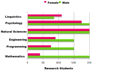
Instructions: The map shows numbers of male and female research students studying six different subjects at a US University in 2011.
The bar graph shows data regarding the number of male and female research students who were studying six different subjects at a US University in 2011. More male students were doing research in mathematics, programming and engineering subjects while in linguistic subjects, and more females were in research related study than their male counterpart. 200 males were doing their research in Mathematics in 2011 while only 40 female students were in the mathematics faculty.
Line Graphs
Line graphs help to compare products/things over time (usually). The dots on specific points are connected to make lines which makes it easier to understand the movement of product throughout the years.
Template: The line graph of ____ shows ___. The ___ increased/decreased over ___ period of time. The ___ were increased but ___ decreased during 000-000.
Example For The above Image:
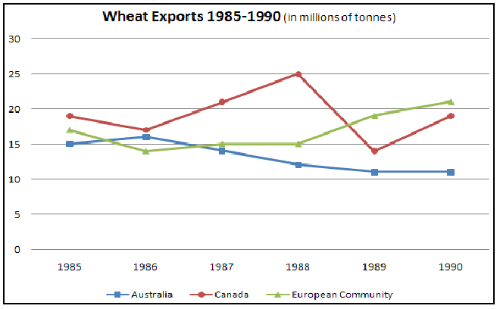
Instructions: The graph shows the difference in wheat exports in three different areas.
The line graph of wheat experts shows a quite different pattern between 1985 and 1990. In 1985, Australia exported around 15 millions of tonnes of wheat and the following year the number seems to increase by one million tonnes to 16 million. After that, there was a gradual decline until 1989 and 1990, when it stabilized at about 11 million tonnes. Over the same period, the amount of Candian exports varied greatly. It started at 19 million tones in 1985, reached a peak in 1988 of 24 million, dropped dramatically in 1989 to 14 million tonnes and then climbed back to 19 million in 1990. Exports from Australia started declining over the five year period, while the Canadian market fluctuated a lot, and the European Community showed on increase.
If you want to practice all these different describe images, do it with our Mock Tests which you get for free with PTE Voucher! Discount & Study Material, Can it get better? Yes, 20 Evaluation Vouchers also included.
Pie Chart
A circle is divided into slices in order to represent numbers or percentages. You might be asked to describe one or multiple pie charts.
Template: The pie chart represents ____. This __ is more than ___ by 00%. ___ share is the largest. Overall, ___.
Example For The Above Image:
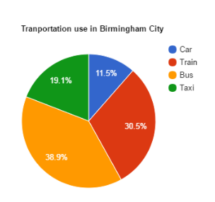
Instructions: The chart shows the percentage of different modes of transportation used by people in Birmingham.
The pie chart depicts the different type of transportation use by people in Birmingham city. People of Birmingham use public transport more as compared to their own vehicles. 38.9 percent of people use buses for daily commuting and 30.5 percent of people travel by train. Only 11.5 percent of people travel by their own cars. 19.1 percent of people travel by taxi in Birmingham city. Overall, buses are the preferred mode of transportation in Birmingham.
Table
A table can be considered the simplest way to put data in a readable manner. It can contain a number or rows and columns.
Template: The table contains the data for _____.. We can see that ___ is more than ___. The maximum is found in __ while the minimum is found in ___. Overall one can say ____.
Example For The Above Image:
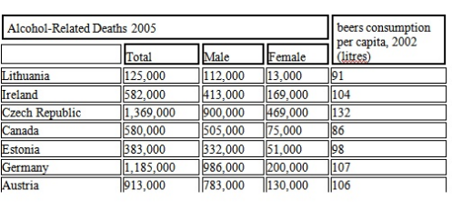
Instructions: The table shows alcohol-related death in 7 countries and the average beer consumption.
The table shows a clear correlation between the litres of beer consumed per capita and a number of alcohol-related deaths. The maximum beer consumption in 2002 was to be found in the Czech Republic, Germany, and Austria, and that each of these regions also had by far utmost alcohol-related deaths in 2005. The Czech Republic has the most beer consumption per litre with over a hundred and thirty for 2002 and it also experienced one million alcohol-related deaths by 2005. The region with the second highest beer consumption was Germany with 107 litres, also has the record for second highest alcohol-related deaths, 1.185 million. In all regions, except Canada it can be seen that the higher the beer consumption, the higher the alcohol-related mortality rate.
NOTE: As you can see, most of the graphs & tables until now have comparison content in the response. It starts with the introduction of what the image is about, then you move onto compare the given numbers. Lastly, end it with a conclusion of the ‘smallest’ and the ‘biggest’.
Maps
A map is a diagrammatic representation of areas or places. It makes it easier to understand the place through a map, so it’s obviously expected of you to understand a map and narrate the same.
Template: The map is of ___. The (location) is ___ kms to the (location). The road is connected by highway/bridge/sea (if applicable). The location has shops/hospital/mall nearby (if applicable). The location is ___.
Example For The Above Image:
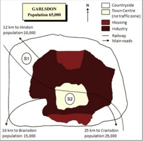
Instruction: The map is of the town Garlsdon. A new supermarket is planned for this town. The Map shows two possible sites for the same.
The first location (S1) is outside the town itself and is sited just off the main road to the town of Hindson, lying 12 kms to the north-west. This site would be able to accommodate a lot of car parking. This can make it accessible for shoppers from both Hindon and Garlsdon who could travel by car. As it is also close to the railway line, it links towns to Cranston, a potentially large number of shoppers would also be able to travel conveniently by train. Suggested location, S2, is right in the town center, which would be good for local residents but as the central area is no-traffic zone, cars would be unable to park and access would be difficult. Neither site is perfect for all the towns but the out-of-town site (S1) would give more advantages.
Cycles
Do you remember the life cycles of plant etc from your science books? Similar kind of cycle will be given to you. All you have to do is convert that cycle into sentences and speak the same.
Template:
The diagram shows ____. The process involves ____. As a result, ____.
Example For The Above Image:
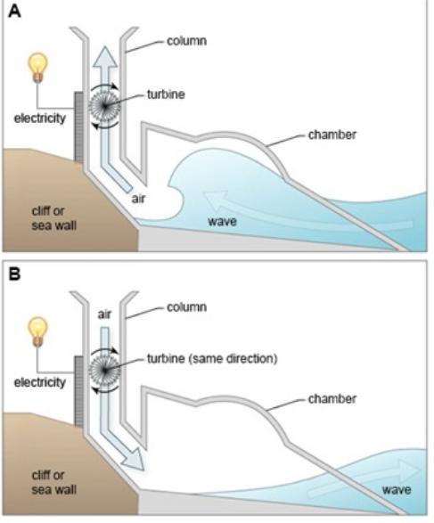
Instructions: The diagram shows the structure that is used to generate electricity from wave power.
Two diagrams show how electricity is generated from the rise and fall of water caused by sea waves. The process involves a structure which is mounted on the side of a cliff or a sea wall. This structure consists of a large chamber. One end is open to the sea and the other leaders into a vertical column which is open to the atmosphere. The first diagram indicates that the moment when the wave approaches the device, water is forced into chamber, applying pressure within the column. The second one depicts the waves retreating. As a result, electricity continues to be generated. The turbine rotates only in one direction, regardless of the direction of air flow.
FlowChart
One can describe it as a process mentioned in steps with arrows. The arrows are used to define the direction os steps. It should not be difficult to describe as you just have to follow the request while reading the steps in your response.
Template: There are ___ stages in ____. First involves ___. Then ___. Finally, it’s ____ to get ___.
Example For The Above Image:
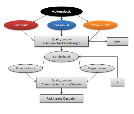
Instructions: Flowchart illustrates the production of colored plastic paper clips in a small factory.
There are four main stages in the production of plastic paper clips from a small factory. Two of these stages involve actual preparation of the clips, while the other two consists of quality control before the clips are sent out from the factory to the retailers to be sold to the public. Molten plastic is poured into three different molds which depends on the color required. Once these clips emerge from the molds a quality control machine checks them for the street. Then clips are stored by hands into two groups, mixed and single colors. After that color mixtures are divided correctly into single colors and mixed color batches. Finally, the clips are packed and dispatched to markets.
Venn Diagram
A logical set of numbers or components are represented by two or more circles which overlap each other to have some common component between them. It may look like a task but the same kind of description can be applied here.
Template: This Venn diagram represents ____. As we can see __ overlaps with ___. While ___ has (these qualities/elements), ___ has (some other). Overall the three of them overlaps for ___.
Example For This Image Above:
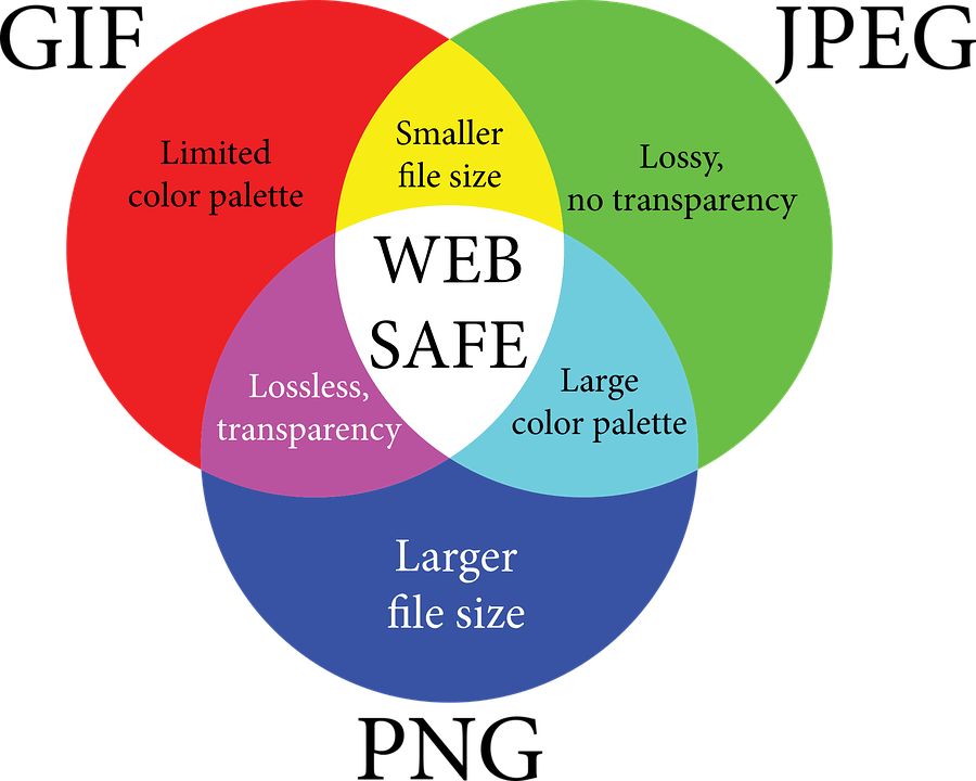
Instructions: A Venn Diagram of the different image files is given with their qualities.
This Venn Diagram shows us three image type: GIF, JPEG, and PNG. GIF has a limited color palette, JPEG is lossy with no transparency and PNG has a larger file size. They also share features. GIF shares smaller file size feature with JPEG while JPEG shares a large color palette feature with PNG. Further, PNG shares lossless, transparency feature with GIF. All three of them share one common feature that is web safety.
Did we forget any PTE describe image type? Tell us about the PTE describe image you have encountered so far! Good luck with PTE Academic!